Most of the work on accessibility is based on compliance. But meaningful lessons come from asking “What else can we do?”
The existing accessibility guidelines are a great starting point, but they don’t cover everything. For example, I learnt that bright colours may lead to sensory overload for neurodivergent people, particularly people with autism. This is an interesting fact in itself, and made me think because I tend to favour bright colour palettes in my projects. This is just a personal preference, so when faced with the challenge of changing it for the better, I went for it.
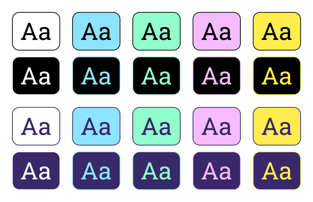
This is a palette I made for a WordPress theme I was working on. It has black and an alternative dark colour, and white and four other bright and saturated accent colours. This means that both dark colours should work with the five bright colours, resulting in enough colour contrast.
I started by reading about it. The wording is almost always the same: using calmer colours instead of bright saturated ones. But this recommendation never included a way to measure how much muted colours should be, or any examples. Unlike contrast ratios, saturation (and its relation to sensory overload) lacks measurable standards.
But I committed to making the necessary changes, and ended up modifying the whole colour palette. The same colours, but desaturated. And like the first version, all colour combinations comply with Web Accessibility Content Guidelines (WCAG) success criteria 1.4.3 Contrast (Minimum) and 1.4.6 Contrast (Enhanced).
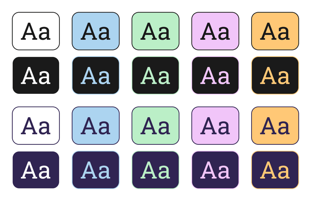
The new palette is more muted and calm, although the overall colour variety and impression are very similar. As the colour combinations still met the colour contrast threshold, and as they still brought to the theme the variety and visual interest I wanted, the only compromise was abandoning my aesthetic preferences, which is secondary for the theme’s functionality.
Until the impact of colour brightness and saturation (and how much it affects users) can be measured, this won’t become a standard. But we can start working on these aspects right now, raising awareness and joining the conversation. Start with real projects. Measure what you change. Document what works. This is how standards eventually form.