How we use colour in the design of a website can lead to accessibility problems. Although these seem easy to fix in principle, they can involve a lot of work if they were not taken into account from the very beginning of the design process.
There are two aspects that are most important when evaluating whether we have issues with colour: contrast and the use of colour.
Contrast
This is the most frequent issue, and we can find websites where almost no page is free of this type of problem.
The principle is very simple: the contrast between the text and the background must be at least 4.5:1 for body text, or 3:1 for large text (generally 18pt or larger, or 14pt or larger if bold, or equivalent sizes for Chinese, Korean, and Japanese alphabets) for Level AA, and 7:1 and 4.5:1 respectively for Level AAA.
It sounds as though choosing suitable colours for the design would be enough, but that is not always so straightforward.
The easiest problem to solve is to stop trying to hide or disguise certain parts of the content. For example, with legally required text or confirmations for accepting terms and conditions. We create an entire design thinking about what we want to communicate and we might fall into the temptation of using a less prominent colour for the parts we feel do not fit the general tone of our site.
If we do that, we are not removing the content or the obligation to have it; we are simply making it harder to read for aesthetic reasons. However, we must be capable of designing websites that are both visually appealing and functional at the same time.
Another problem that frequently occurs is that corporate or brand colours do not have good contrast. For instance, when we adapt colours from a brand that was designed for print to a screen, the colours are not always suitable. Print colours are subtractive, meaning that mixing colours results in a darker outcome, whereas screen colours are additive, and the opposite occurs. This is why trying to copy a colour exactly onto a screen does not always work, even if it does on paper. This error is easy to correct at a technical level, but it requires more work from a design perspective.
Use of colour
In addition to using colours with good contrast, we cannot use colour to convey information or distinguish elements.
For example, in a form. Marking a field in red if there is an error is fine, because we point out the error where it occurs, but we cannot use that red as the sole indication of the error. We must use text or other visual elements to indicate it.
Or if we have a list of options, indicating which ones are selected only with a change in background colour is not enough. We must use elements such as additional icons (for example) to be able to distinguish it even if we cannot perceive colour.
This rule is often a bit harder to understand because, sometimes, a change or information through colour is visually very clear and easy to perceive, and it seems obvious. But some people cannot perceive colour, or they do so differently, so the interpretation of the use of colour is not always as obvious as it might seem to us.
Conclusion
The use of colour affects the accessibility of a website both through the qualities of the chosen colours and the intentionality of their use to display information. Solving this involves, at times, rethinking which colours we use and how; this can be a complex task. But in the end, we always achieve a better design, which is more useful and appropriate for a wider section of our audience.
Fran Rosa, Senior Developer & Advocate specializing in people-first development
No. Unfortunately, we cannot automate accessibility. And that is not likely to change in the future.
Tools already exist that automatically analyse the accessibility of a website. For example, WAVE is a suite of tools that helps us identify failures in compliance with accessibility guidelines. If we use one of its extensions for different browsers, we get a list of potential non-compliances while browsing the page, pointing out the specific point of failure with information on how to fix it.
Another example is Axe-core. This is an open-source tool that can be used to automatically analyse an entire website. We also get a list of non-compliances with precise information on how to locate them. These are just two examples of free tools, but many other paid tools and services exist.
So, why can we not automate accessibility on a website?
Firstly, because tools generally report a non-compliance, but are not necessarily capable of fixing it. The simplest example is with images. A tool tells us that an image has no alternative text, but it cannot assess whether that image is purely decorative or not, nor what alternative text would be appropriate.
And you might be thinking: Can an AI not see what is in the image? And the answer is yes, more or less. Because the alternative text of an image depends on an intentional human decision to use that image, one must know that intention to provide good alternative text.
An example: a member of a company’s team receives an award, and we publish a photo on the company blog. In that photo, we see “two people, one of them holding an award”. Would that be a good alternative text? Because if we publish it to announce that someone has won that award, we would need to include their name, mention that they are part of the company team, and, if the award is related to a company project, probably mention that as well. It all depends on the intention behind publishing that photo.
Another reason why automatic tools are sometimes insufficient is that there are errors (even those that are errors in the code) which are impossible to detect.
Another example: if we have tabbed navigation in one part of the website, the implementation requires relating each tab to its corresponding content, marking which one is active or visible at that moment, making it keyboard-navigable, and so on. You can see full examples of a tab pattern implementation in the Accessible Rich Internet Applications (ARIA) Authoring Practices Guide. If we have done the entire implementation correctly and have only forgotten to mark which tab is active, an automatic tool might recognise the implementation pattern and indicate the missing part.
But if we have only implemented it visually without adding any of the necessary parts in the code, how can the automatic tool know that we are implementing tabbed navigation?
These limitations mean that automating the detection of accessibility issues is very useful, but insufficient. It can help us detect oversights and improve the development and implementation of new content, but it cannot detect everything or offer solutions. And we might fall into the error of thinking that if an automatic tool does not detect any faults, it is because there are none, which is not necessarily the case. Tools help us, but they do not replace knowledge or human factors such as intention.
Fran Rosa, Senior Developer & Advocate specialising in people-first development
The document that sets out the guidelines against which the accessibility of websites and mobile applications is measured is known as the “Web Content Accessibility Guidelines” (frequently referred to as WCAG).
This document is used as a reference for developing accessible digital projects and auditing the accessibility of existing ones. Consequently, to be included in the document, guidelines must meet two criteria:
- They must address significant access issues that particularly affect people with disabilities (meaning they go beyond the usability issues that affect everyone).
- They must be verifiable, so that compliance can be measured with a high degree of reliability.
The laws regulating sites that are required to be accessible are based on this document.
Something that occasionally causes a bit of confusion is that the guidelines are divided into three levels: A, AA, and AAA. These are cumulative, which means that to achieve Level AA (which is the standard recommendation and the one mentioned by law), all Level A and Level AA guidelines must be met. It is also possible that some may not apply; for instance, those referring to audio and/or video content do not apply if the site does not contain that type of content.
Levels are assigned based on how essential each guideline is, whether it is possible to meet it across different types of sites and content, and whether it is reasonable for content creators to comply with it. Thus, Level A guidelines are minimum requirements that remove basic obstacles; Level AA guidelines are the standard that improves accessibility for a wider range of people; and Level AAA guidelines represent the highest level of exigency, and it is not realistic to expect all types of content to meet them.
If we analyse the guidelines for interactive elements or forms, the expectation of coding knowledge is higher than for guidelines such as the use of images or colours, as it is reasonable to assume that whoever implements interactivity or forms on a website will have sufficient coding skills to meet the criteria.
The levels exist because the rigorous work involved in creating the guidelines focuses not only on how they affect the people who will use the website, but also takes into account the task of implementing them. Although we generally focus on the obligation to comply with certain guidelines, we have access to a broad list of meaningful and measurable criteria, and the levels serve as additional information for their fulfilment.
Fran Rosa, Senior Developer & Advocate specialising in people-first development
In a recent conversation with an expert digital and UX designer, I mentioned that it is generally not a good idea to evaluate accessibility and user experience at the same time. Their response was that accessibility is just "good UX for everyone." While that is a poetic way to put it, I still believe it is a mistake to treat accessibility merely as a subset of user experience.
To begin with, how we evaluate each one is fundamentally different. Although best practices exist, UX is measured on a project-by-project basis depending on how a person perceives, uses, and completes specific tasks. In that sense, being satisfied with the outcome or achieving our initial goal is not necessarily the same thing.
Understanding the history of UX as a discipline is vital here. While we can look at early advances in ergonomics or psychology as precursors, it was in 1982 that the concept of Human-Computer Interaction emerged, focusing on making interaction possible and effective. Following the publication of Jakob Nielsen and Rolf Molich’s "10 Usability Heuristics" in 1989, the term "usability" gained popularity, focusing on error reduction and efficiency.
"User Experience" was a concept coined by Don Norman while working at Apple in 1993. It focused on analysing systems holistically, always from the user's perspective. This marked an essential shift in approach: what the user thinks, experiences, or feels became the primary metric of success. Throughout the first decade of the 2000s, the idea spread that all processes and decisions should be measured through the lens of UX.
This was revolutionary, especially from a commercial standpoint, but it also makes some conversations harder. For instance, a concept born from this design philosophy is the "optimistic user interface" (link to the article "True Lies Of Optimistic User Interfaces" by Denis Mishunov). This is based on the idea that when interacting with a mobile interface, instead of waiting for a server response, the UI should show that the task is already complete — even if it hasn't happened yet. This creates an illusion of instantaneity for the user; if an error eventually occurs, it can be reported later. We see this daily on social media when we "like" a post or add a comment; the UI updates instantly, even before the data has actually reached the server.
In this case, the interface is lying to sell us an illusion of speed. The logic is that the positive effect of instant feedback outweighs the negative impact if the interaction disappears due to a later failure. This illustrates how, by mixing so many disciplines in the same pot, UX always ends up being a negotiation between multiple factors.
When we talk about accessibility, however, the criteria are usually much more rigid. Is the component properly implemented for screen reader use? Can the user stop or pause videos and animations? Is there alternative text for images or multimedia? The answer is usually a "yes" or "no" — there is no room for negotiation. In accessibility, it is not acceptable to have an undersized button or poor colour contrast just because it might provide a different "emotional experience" for the user.
Therefore, while integrating accessibility into various stages of the process (such as design or development) helps a constantly evolving project remain accessible, we must understand that accessibility criteria are non-negotiable minimum requirements. They are not optional goals to be traded off against other design considerations.
Fran Rosa, Senior Developer & Advocate specialising in people-first development
Volcanic Internet joins Asana Partners
Volcanic Internet announces it’s an Asana Channel Partner delivering solutions for distributed work
Olot, Girona (May 17th, 2022) – Volcanic Internet, today announced it’s joined Asana Partners, expanding Asana’s global Channel Partner network of trusted providers offering professional services to ensure success with Asana. Asana Partners help companies of all sizes enhance and advance their digital transformation efforts, enabling them to deploy with confidence, learn from experts and gain access to custom solutions.
Featuring partnerships with industry leaders, including Dell and SHI, Asana’s global Channel network connects customers with leading solutions, reseller and systems integrator experts in 75 countries to eliminate information silos and help organizations coordinate their work with clarity. Hand-selected for their capabilities in enterprise software and change management, partners offer professional and technical services to ensure success for distributed workers, from deploying Asana to setting up workflows to building custom solutions. Undergoing a rigorous certification program, partners offer training and resources covering a wide range of needs and skills, across teams and timezones. From planning and prioritizing projects, to setting goals and staying aligned, Channel Partners help organizations fast track their digital transformation efforts.
Volcanic Internet has its client's satisfaction at the core of its mission and Asana has been Volcanic’s main tool for the past 10 years to help them in their digital transformation processes and boost their productivity. The services provided range from onboarding, consulting, training, and support services to helping them to thrive in their day-to-day activities.
“Becoming an Asana Partner means a lot for Volcanic, it has been our core tool since Day 1,” said David Jane, Volcanic Internet coFounder, “and from our own experience, we know what an improvement it means for an organization to have the right tools and the right systems to boost its capabilities and productivity to its best. We can’t wait to help more teams in our region to succeed in their digital transformation process”
“We’re thrilled that Volcanic Internet has joined Asana Partners, expanding our global Channel Partner network to help our customers accelerate their use of Asana and achieve success, whether they’re collaborating in-person or remotely, ” said Mary-Patton Eisen, Global Head of Channel Partnerships, Asana. “Our trusted Channel Partners, including Volcanic Internet, are enabling our customers to unlock more value from Asana by providing them with a single platform for distributed work that enables them to move faster and coordinate their work seamlessly, no matter where they are located.”
Asana helps more than 119,00paying organizations and millions of free organizations across 190 countries orchestrate their work, from small projects to strategic initiatives. Leading companies rely on Asana to manage everything from company objectives to digital transformation to product launches and marketing campaigns.
For more information about Asana Partners and how it can benefit your business, visit: asana.com/partners
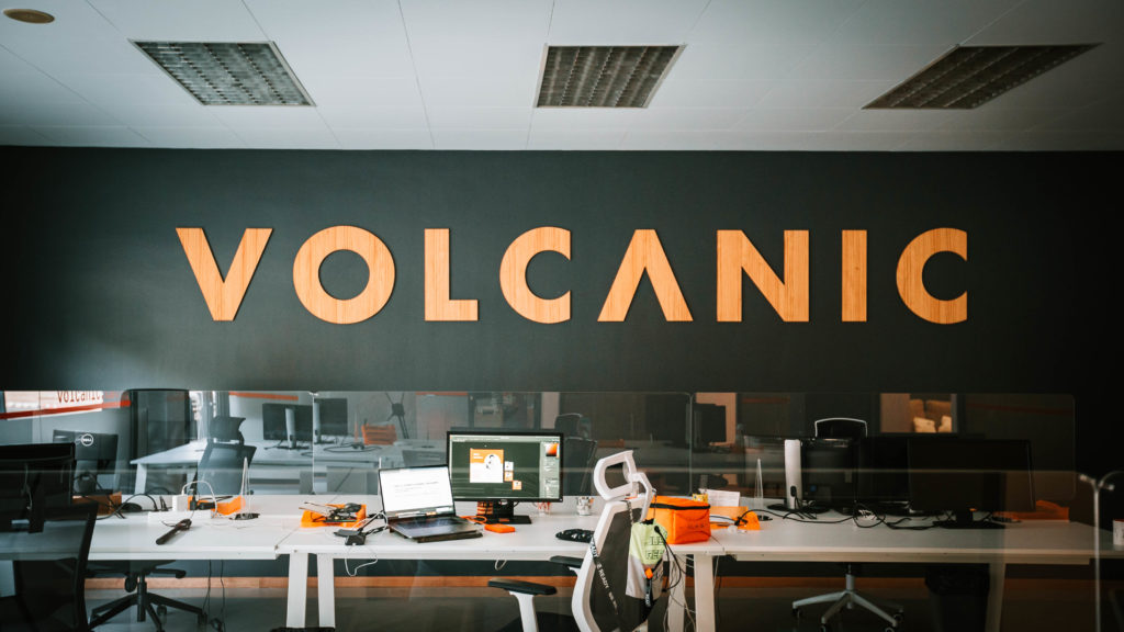
About Volcanic Internet:
Volcanic Internet was founded in 2009 and nowadays has a team of +40 professionals committed to delivering tailored technology solutions to its customers.
With its headquarters in Olot, Girona, it works for companies all over the world providing software development and digital transformation services.
At Volcanic Internet, we help businesses achieve business goals with our development expertise. We’re a Catalunya-based development company that helps entrepreneurs have sophisticated custom solutions that could make them stand out from the competition. We provide numerous development services, code outsourcing, UI/UX design, data scraping, digital and marketing strategies, SEO and SEM, chatbots, tech support, and more. Our team provides numerous solutions tailored to our clients’ businesses needs.
In line with that, we’re stoked to receive our very first review on Clutch, which highlights our expertise as a development company. For those who didn’t know, Clutch is a B2B market research platform located at the heart of Washington, DC. Their goal is to help businesses, no matter how big or small, identify and connect with the agencies they need to achieve their goals. They cover different industries, and their team conducts in-depth interviews with clients about the quality of their service and deliverables. Moreover, Clutch meticulously creates lists of the market leaders by industry and location.
The review came from Insilkt intelligence, an AI development company. We provide staff augmentation and software development services using Node.js, PostgreSQL, Docker, and Kubernetes. Our team continues to work with the client to develop better versions and features of the solution.
It’s overwhelming to see how pleased our client has been with our performance and quality of work. We have clear communication and are very flexible in every change in the project.
Overall, the engagement is a success so far! The client rated us on the quality of our services, scheduling, cost, willingness to refer, and overall satisfaction. We’re stoked that our very first Clutch review received a five-star on overall metrics.
In addition, we are thrilled to announce that The Manifest recognized our efforts and included us in their list of top e-commerce app development companies in Barcelona! The Manifest is a useful guide and platform, compiling and analyzing practical business wisdom for innovators, entrepreneurs, and industry managers. They work hard to allow users to find experts by creating lists of the absolute best agencies. With that, we are very happy to be featured on their platform.
Our team would like to extend our gratitude to our clients who took the time to review our work. This opened our eyes to valuable insights and inspired us to keep working harder.
Contact us! Let’s talk about your business goals and problems and make a solution together. We’d love to help you be more competitive in the market.